

Appearance
The Layout Grid
Rows and Columns
Pianola works with rows and columns in a 12-column layout grid, which helps both to align elements and group them.
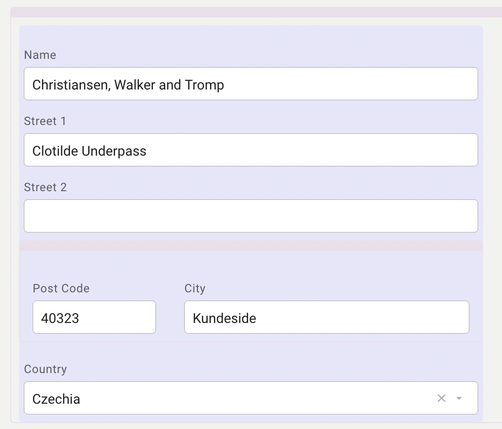
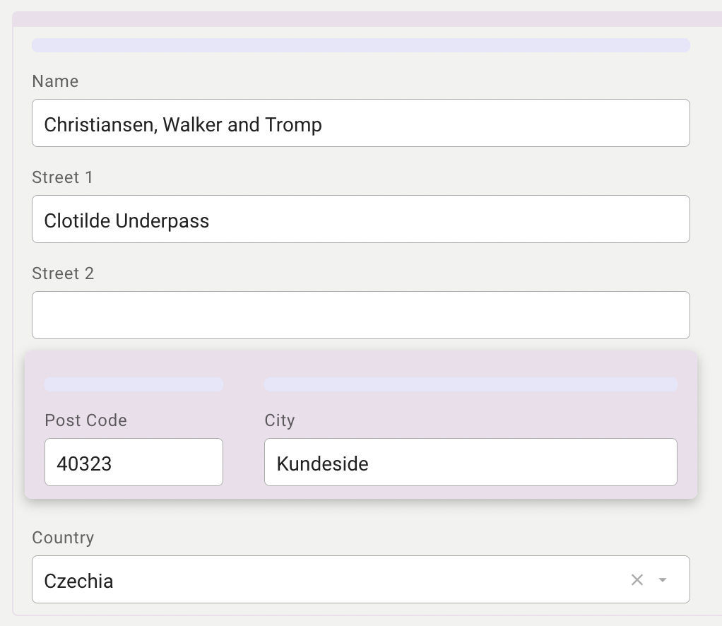
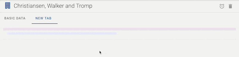
In config mode, rows are indicated with a rose-colored bar and a line drawn around the content of the bar:
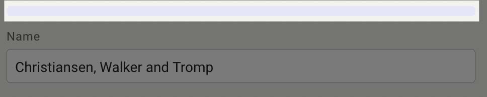
Similarly, columns are colored with a light blue bar and line:
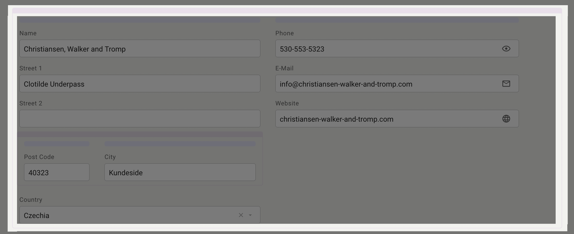
If you click on the bar of a row or a column, the entire row / column becomes selected:
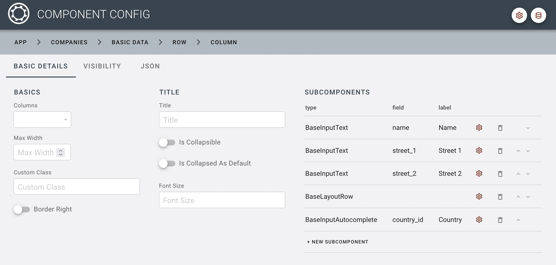
Like any other component type, selecting a colum or a row allows you to edit its configurations in the config panel:
It is possible to nest rows within columns, to allow for further divison of the layout space:
12-column grid system
When you add columns to a row, the columns are spaced out evenly across the row.
However, if you want to create a different spacing of the columns, you can enter a value from 1 to 12 in the column configuration's "columns" setting:
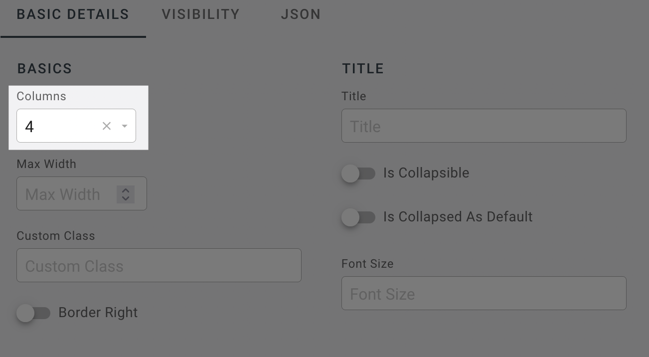
This number divided by 12 corresponds to the width taken up by the column within the row, i.e. 4/12 or 1/3. The 12-column grid allows for the easy entry of commonly used widths: 2 => 1/6 of the row, 3 => 1/4, 4 => 1/3, 6 => 1/2, 8 => 2/3, 9 => 3/4
It is also perfectly fine to distribute the columns with widths of 5 and 7 - the important thing is that the number of columns add up to 12, or else the columns will start to stack on top of each other.
There are a few more things worth mentioning about the column settings:
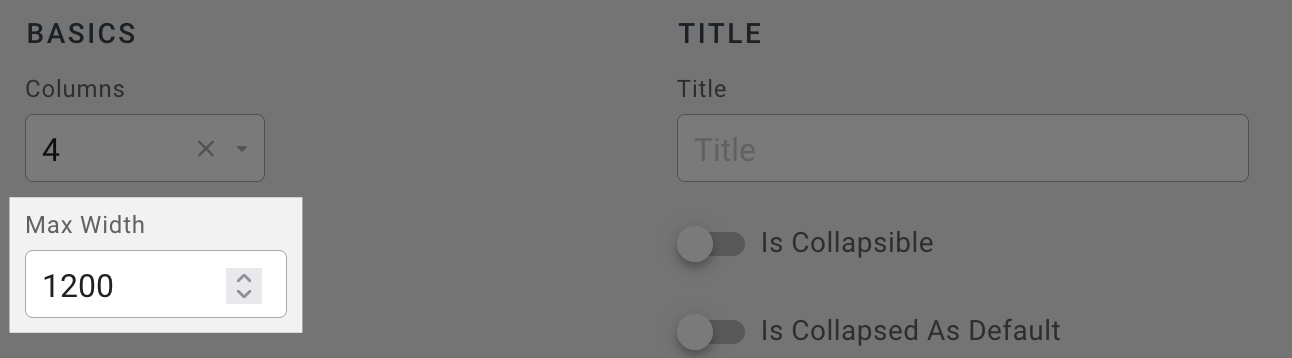
- Columns have a default maximum width of 700px. This is to prevent columns becoming oversized on big screens and to limit them to a pleasant width. If you would like to have columns bigger than 700px, you need to change the maximum width setting in the configuration panel for the relevant column:
If you leave the number of columns empty in some columns but not the others, the system will simply distribute the remaining space to the columns with an undefined "columns" setting. E.g. if you have three columns, and mark the first one as 5, the remaining two columns will be distributed with the remaining 7/12 of the space.
You can also create empty columns with no further components in them. This is practical if you want to limit the width of an element or create extra space between two other components. Please note, however, that many components offer their own props to limit the width, so creating a row with empty columns is often the less practical way to achieve this.
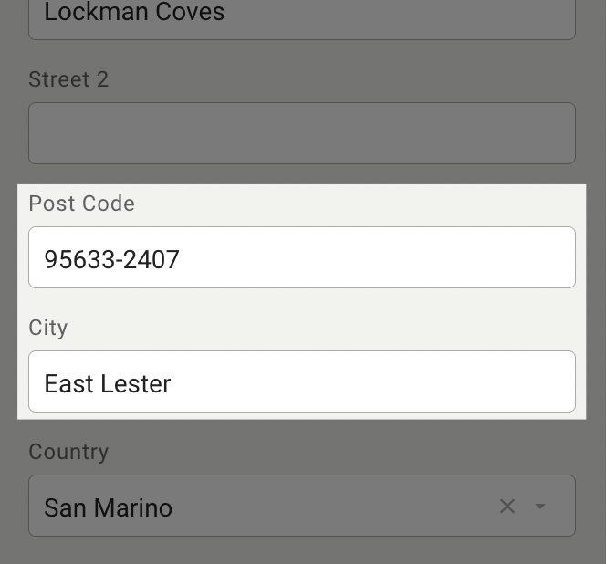
In smaller viewports (screen sizes below 958px wide), columns are no longer distributed alongside each other within a row, but stacked on top of each other:
Creating / moving / deleting columns and rows
If you hover over the bar of an existing row or column, you will see a small palette of buttons:
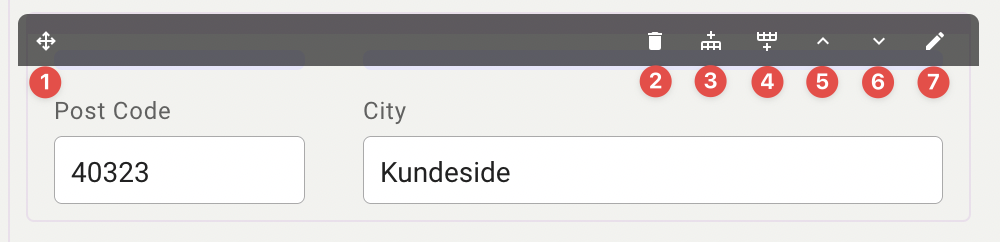
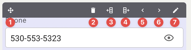
These buttons have the following function:
- Handle to drag and drop row / column
- Delete row / column
- Add new row above / new column to the left
- Add row row below / new column to the right
- Move row up / column to the left
- Move row down / column to the right
- Edit row / column config
Adding a new row / column
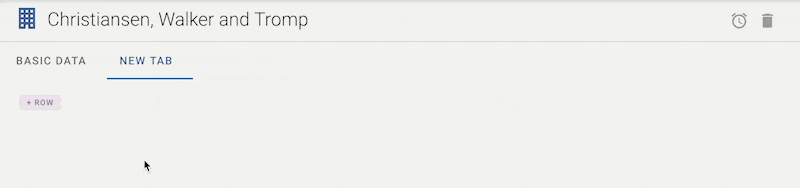
If you start with an empty layout or an empty tab (see section on Module Config on how to manage top-level tabs), you will be presented with a button to create a fresh row. Every row automatically comes with one column inside it:
If you want to add a new row or a new column, the easiest way is to use the "add new row/column" buttons in the toolbar of an existing row or column:
Moving Rows and Columns
If you want to change the order of rows or columns, you can use the arrow buttons to send the selected row up or down, or the selected column to the right or to the left:
Even though the buttons add a fast way to change a row or column's position, you may find it more intuitive to drag and drop a row or column to its right place:
Columns can be dragged to different locations within the layout, but must be dropped within a row, either as a new column or alongside an existing column:
Deleting Rows and Columns
If you want to get rid of a row or a column, it's as simple as pressing the bin button in the toolbar, and confirming the warning dialog:
Please note that any contents within the deleted row or column will also be deleted, so tread carefully!